Reinventing soniq's applications
My role
UX/UI Designer / Designer Engineer.
Team Structure
I collaborated with the Design team (Product Design Lead and 4 UX Designers), Product Owners from different teams, and Developers.
Background
In my last role, I had the opportunity to contribute to soniq, an industry expert in building future-proof digital solutions for the cleaning industry. Its mission is to make life easier with software for everyone who cleans professionally.
To achieve this, they offer two main applications:
- A web app specifically designed for team management.
- A super handy mobile app tailor-made for employees.
How I helped
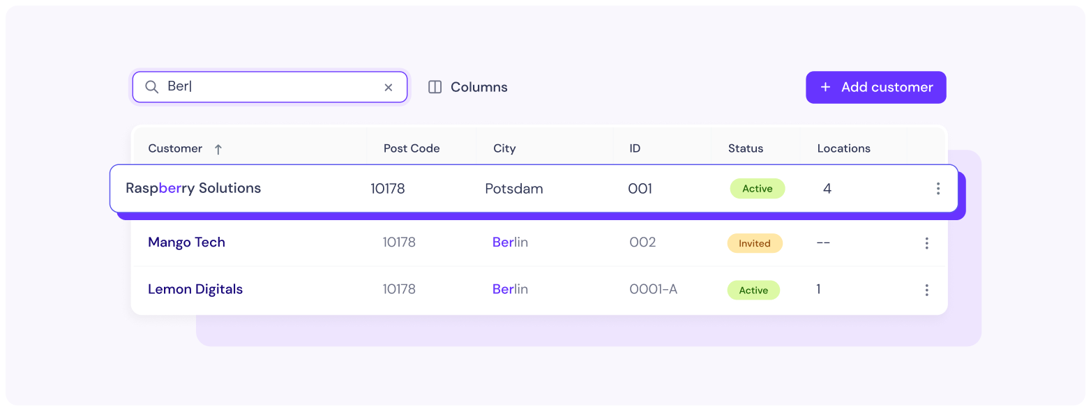
During my time on the project, the company went through a rebranding process that involved changing its target audience and overall objectives. This meant we had to give the products a complete makeover, from new structures to a brand-new design language.
I had the opportunity to be a part of the entire journey, collaborating closely with both the web and mobile teams. My role was to focus on the design aspect, working closely with a multidisciplinary team to shape the new structure and create a fresh UI that perfectly met the users' needs.
Design Process
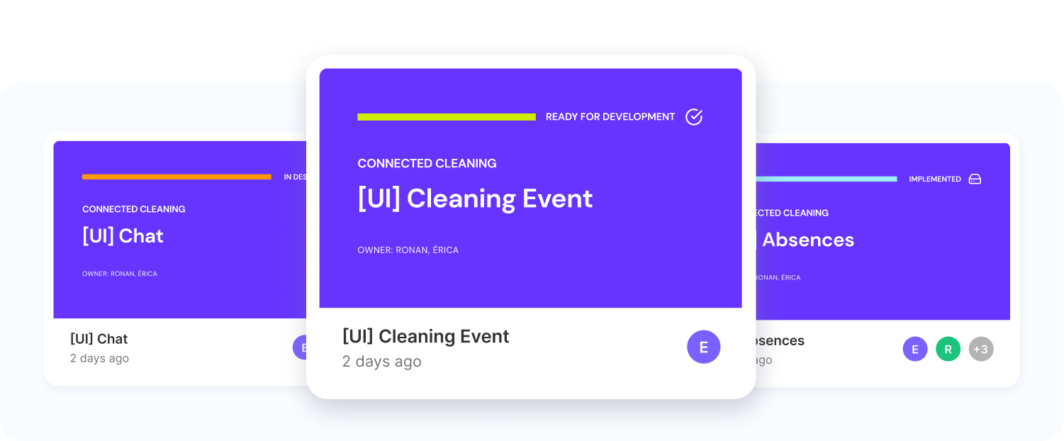
From research analysis to final UI deliverables, my primary responsibility was ensuring a smooth transition from UX to development. I actively participated in UX decision-making and workshops to ensure that our designs were not only aesthetically pleasing but also functional and intuitive.
Here's an overview of my activities:
- Collaborating with Product Owners and developers to establish priorities and align our goals.
- Translating research findings into wireframes that provided a blueprint for our designs.
- Iterating and validating wireframes to ensure consistency, accessibility, and a great user experience.
- Bringing those wireframes to life by creating polished UI designs that were visually appealing and aligned with our brand.
- Handing over the designs to the development team and maintaining open communication to address any questions or concerns.
- Conducting regular review meetings with the development team to ensure the designs were implemented accurately.
Deliverables
To keep things running smoothly, we followed a biweekly sprint approach, working closely with both the mobile and web teams.
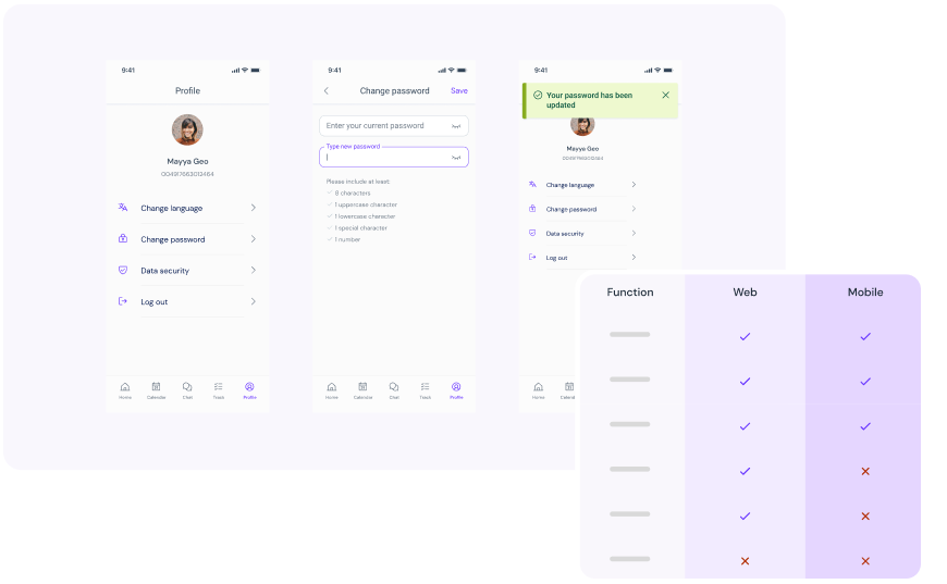
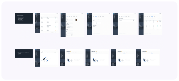
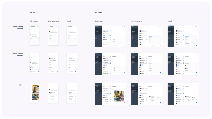
As part of my deliverables, I provided neat and meticulously organised Figma files to the development team. This allowed a seamless collaboration and efficient translation of designs into functional products.

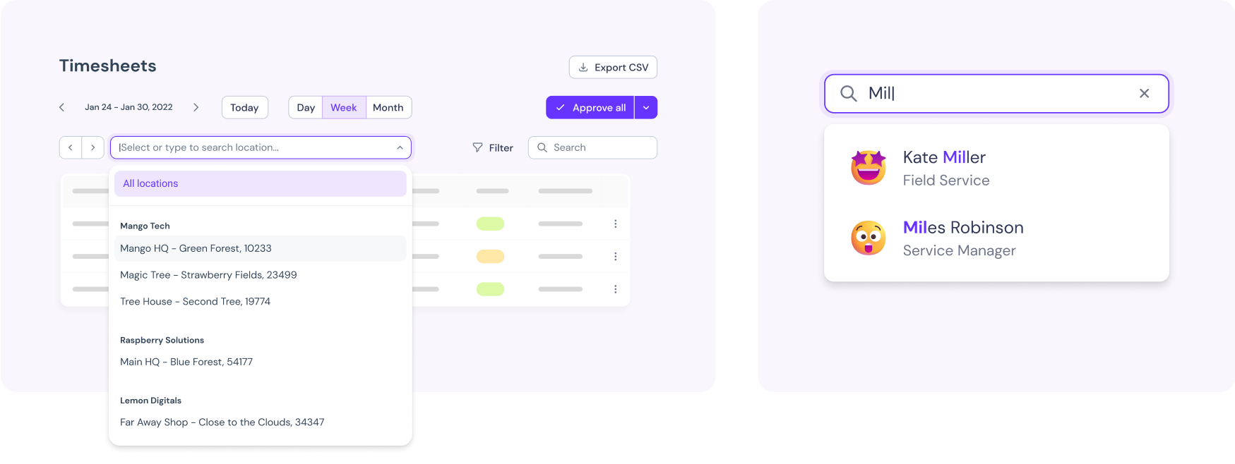
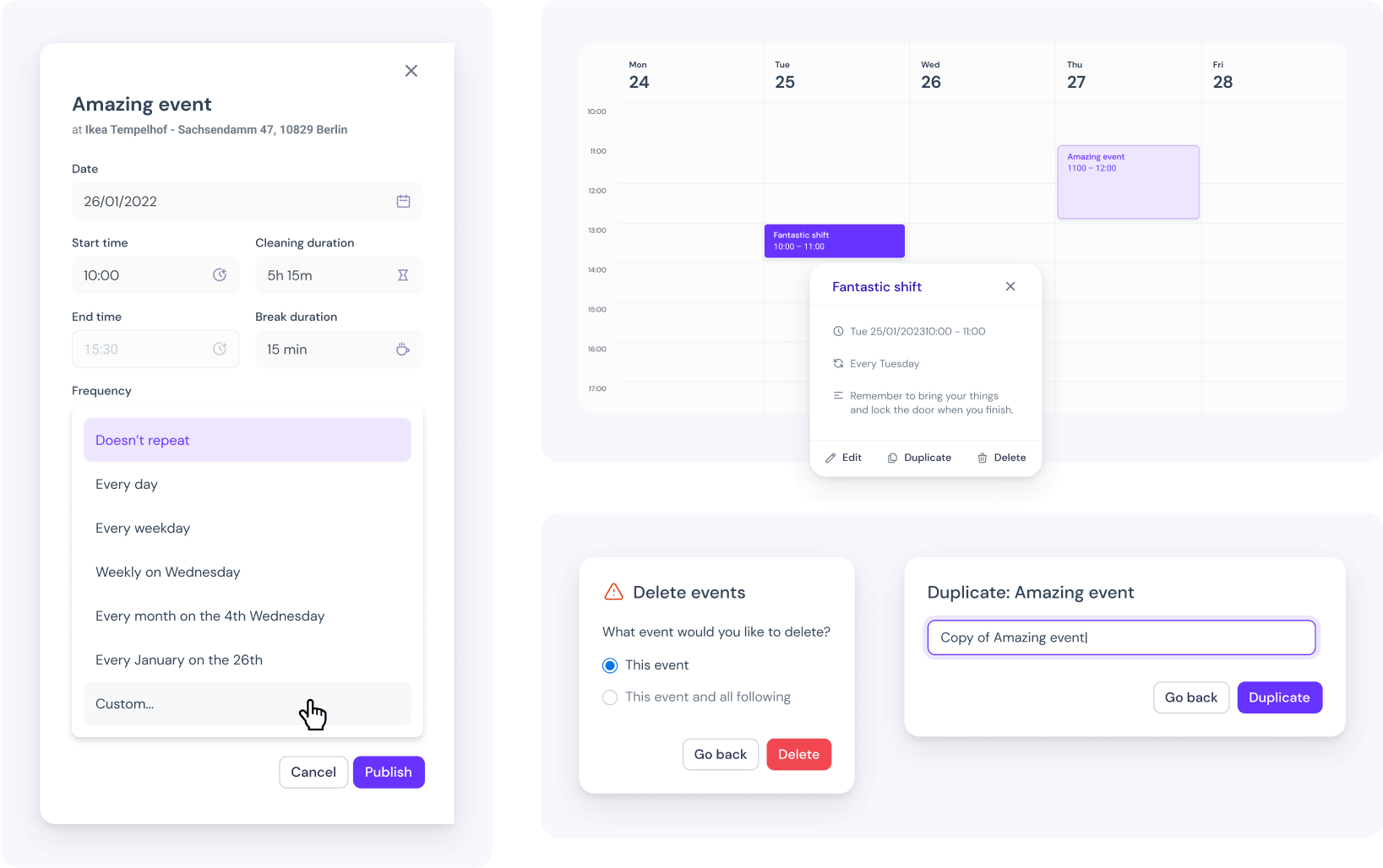
Additionally, I took on the responsibility of developing Soniq's Design System while working on both the web and mobile applications. It was an exciting journey that helped us establish a cohesive design language and maintain consistency across all products.
If you're interested in learning more about it, feel free to take a closer look here. 😊