soniq Design System
My role
Design System Lead.
Team Structure
By the end of the project, I collaborated with the Product Design Lead, 4 UX Designers and 3 different teams of Developers.
Background
soniq, founded in 2015, is an industry expert in building future-proof digital solutions for the cleaning industry. Its mission is to make life easier with software for everyone who cleans professionally.
During my time there (2020-2023), they went through a significant rebranding process that involved changing their target audience and refining their main goals. That meant we had to reimagine everything, from the structure of the products to a fresh new visual language.
How I helped
As the main UI Designer for both the web and mobile apps, I was responsible for developing our brand-new Design System.
This involved setting priorities, aligning with developers, establishing patterns, creating components and documentation in Figma, and handing them over to the development team.
The main challenge was bridging the design-development gap.
Spoiler alert: it all worked really well, and we found an effective process that kept us on the same page.
Deliverables
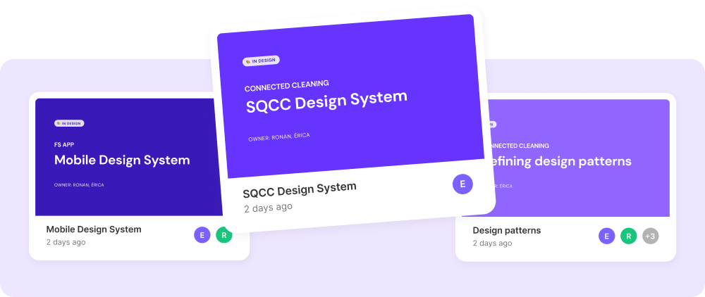
Our superstar deliverable was a user-friendly and well-structured Figma file that became the rock-solid foundation for the design work. It covered the following areas:
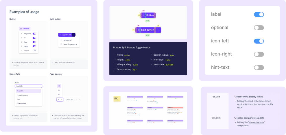
- Visual Language: the essence of our designs, including colour, typography, spacing, grids, breakpoints, etc.
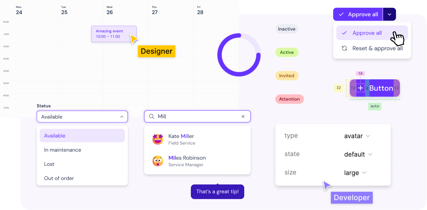
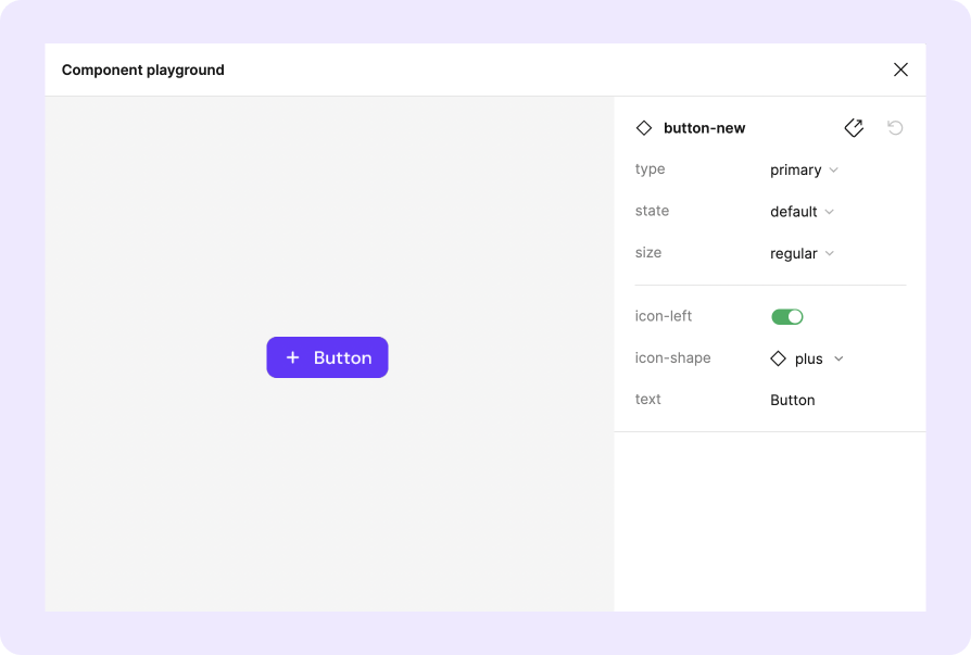
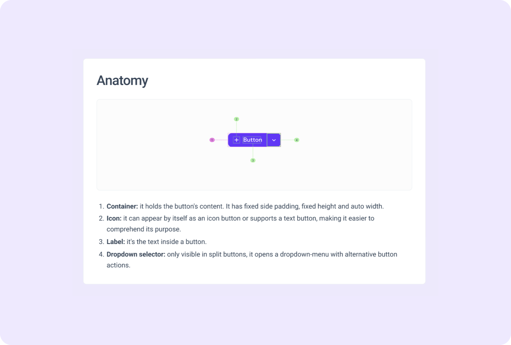
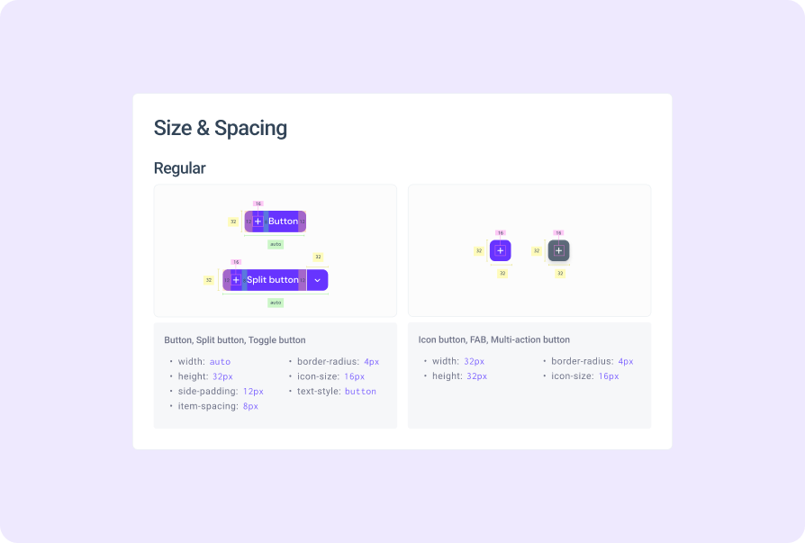
- Base Components: like the atoms in the atomic design approach, they served as the fundamental building blocks of our UI - buttons, thumbnails, chips, selectors, etc.
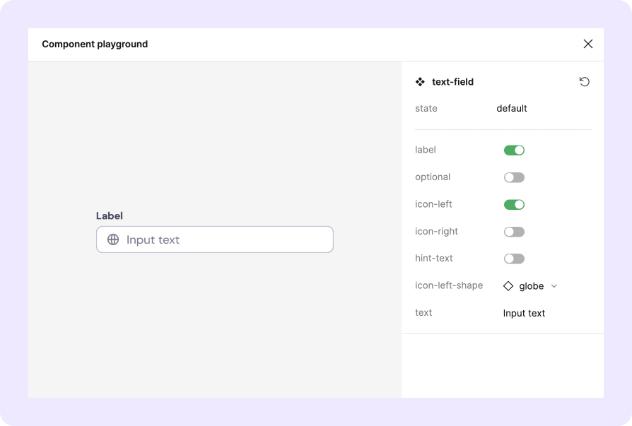
- Components: from simple text fields to complex calendars and tables, they were designed for easy reusability and flexibility to meet designer needs.
- Design Patterns: to ensure consistency and that everyone in the team is speaking the same language, we established guidelines for components usage and behaviour. Each one of the patterns was well-thought and established as a team, quickly becoming one of the most useful (read: favourite!) parts of the system.
- Change log: we introduced a handy change log, tracking and noting every little update on the system. With components evolving so quickly, it helped us in staying transparent and aligned.
Design System Work
I took the lead in creating a system that would make our day-to-day tasks easier and ensure consistency, efficiency, and seamless collaboration across teams.
Here’s an overview of how I worked:
- Leading Design System meetings to align priorities and synchronise with the sprint cycles
- Creating and documenting the component library - which became our pride and joy!
- Collaborating with designers and developers together on a biweekly basis to validate the components' effectiveness and address any potential issues
- Running 'Design patterns' workshops with members of different teams, from product owners to developers
- Conducting review meetings with the teams
- Reviewing implementation, guaranteeing that both development and design libraries were synched
If there’s one thing I take from the amazing work we did together is that collaboration and communication were the keys to our success.
Results
Now, let's talk about the incredible results we achieved by implementing our Design System at soniq:
- Bridging the gap between design and development: communication and collaboration reached new heights! Now, design and dev teams are on the same page, working together like never before. 🚀
- Empowered designers: with our super easy-to-use library of pre-built components, designers are saving valuable time on their tasks. That means more focus on other crucial design aspects, such as creating exceptional user experiences and iterating more efficiently. Quality & speed at their finest! 👑
- Consistency and time saving: the system is now a solid foundation for the design work, and consistency became our best friend. With the system in place, everything flows smoothly: the team saves a lot of time, and it’s so much easier to keep a cohesive visual language. A total game-changer! 💪
- Smooth onboarding: as the Design System became the single source of truth for our design assets, new team members can quickly jump in and contribute with ease. 🤗
- Scalability: with the product growing so quickly, the Design System has proven to be an essential and reliable ally - a helpful friend that supports the team all the way, growing and evolving alongside the product. 🌱
All in all, implementing the Design System resulted in improved communication, increased efficiency, and saved precious time for designers and developers. It enhanced collaboration, consistency, and empowered the team to deliver high-quality products that truly met the needs of our users. It's been an incredible journey, and I'm proud of what we accomplished together!